Friday, March 30, 2012

Graph: US Supreme Court Justices - Age and Tenure

What are the age and tenure trends of US Supreme Court justices? Which are the youngest and oldest justices in recent times? How have the tenures changed over the years? My interest in these questions was piqued by a recent Wall Street Journal article, written by Berkeley law professor John Yoo on the Obamacare hearings, which alluded to the increasing age and tenure of Supreme Court justices in recent times. The next series of graphs would examine these questions.

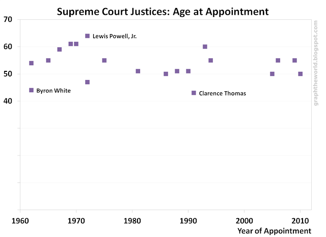
This graph looks at the age of the justices that were appointed since 1960. As you can see the youngest justice at appointment date is Clarence Thomas (he was aged 43 at appointment), appointed by President George H.W. Bush in 1991. The next youngest is Byron White (he was aged 44 at appointment), appointed by President John F. Kennedy in 1962. The oldest justice at appointment is Lewis Powell, Jr, who was aged 64 when he was appointed by President Nixon in 1972. The average age of the justices appointed from 1960 onward was around 53.6 years.
Data Source: US Supreme Court

The next graph looks at the age of the Supreme Court justices at the end of the tenure, as well as the length of their tenure, for the justices that left the Supreme Court (either through retirement or death) from 1960 onward. John Paul Stevens was the oldest, at 90, when he retired; William Douglas had the longest tenure at more than 36 years. Arthur Goldberg was the youngest, at 54, when he retired; his tenure was also the shortest - less than 2 years. 
Data Source: US Supreme Court
In general, the length of tenure correlated to a higher age at the end of tenure (also according to common size). The 1960s was in general a period where there were a number of short tenures (and younger justices), but the retirement ages and tenures of the justices were higher from 1970 onward.


This last graph shows the average age and average length of tenure of the serving justices from 1960 to 2012. The average age is around 60-70 years old; the average tenure is around 10-20 years. We can see (and common sense tells us) that the average age and length of tenure decrease during the years when new justices are appointed (especially since new justices are typically younger than the existing justices). In particular, we can see that there was a period between 1994 to 2005 when there were no new justices appointed. The average age and tenures of the serving justices increased during that time.
Data Source: US Supreme Court

Can you spot any other trends? Or what other trends do you think might be interesting? Do leave your comments.

Data Source: US Supreme Court; Graphs: Generated by me

Friday, March 16, 2012

Tip: Where To Find Free Images For Your Website or Blog

Where can you find free images for your website or blog? This tip shows you where! 
Want an Apple image for free?
Most of these sites selected allow the use of the images for many purposes (including on your website or blog as well as some commercial purposes) without attribution, but the policy can differ from image to image, so do check carefully before you use! Here’s the list of top 6 places to get your free images: 

 This is one of the largest and most popular sites, with almost 400,000 images online. The images are of high quality and include illustrations and vectors for free. You can check out their image use policy. One thing to note – you will have to sign up (it’s a simple process) in order to download the images.
Assessment: One of the best!
This site was set up in 1996 and is “by creatives for creatives”. The images now number more than 260,000. They are mostly of high quality and they are free too! There’s also a search function which can come in useful. You can check out the Morguefile license. One good thing is that you do not need to register in order to download any image.
Assessment: One of the best!

3) Pixabay
This is another site with thousands of high-quality images. These are all free to use personally and commercially without attribution, according to the terms of use). You also do not need to register to download any image. The design of the site is also very clean and easy to use.
Assessment: Another one of the best!
This site was formed with the goal to “provide quality stock photos for commercial and non-commercial use. For free.” The images are either shot by Freerange themselves, from their archives or contributed by their community. The images also go through processing (e.g. sharpening, colour correcting, cropping, keywording), so the quality of the images is very high. This makes the collection slightly smaller, but it’s still sizable (and of very high quality!) One thing to note – you will have to sign up (it’s a simple process) in order to download the images. Check out their license.
Assessment: A great site.
Pixel Perfect Digital is a site with some photography news, but one of the main attractions is that it has a stock photo collection. You can use the images on your websites, according to the terms of use. The collection (at around 16,000 images) is a little smaller than the others, but the images are good quality ones.
Assessment: A good site.
While most of the photos and images are in the public domain and may be used and reproduced without permission or fee, some photos and images may be protected by license. In addition, the government agencies do ask for attribution when using the images – for example, the photolibrary of the National Oceanic & Atmospheric Administration (NOAA), and NASA, so use with care.
Assessment: An amazingly rich collection, but check license before use.

Thursday, March 15, 2012

Tip: How To Make Free Maps For Your Blog or Website

How do you make a world map (or regional / country maps) with data that you can use on your blog or website? Google Maps is obviously one tool that can be used, but I do not like the interface and the colours. The customization of features is also somewhat limited. This tip shows you some good tools (online and offline) that you can use to generate and customize such maps.

1) Gunn Interactive
This is a very good tool to depict your data on a world map. You can load your own data by pasting it into the site (e.g. by copying from an Excel file or similar formats). You can then edit data (you have to double-check the country name as it may not match the exact country name listed in the site).

This tool is quite easily customized – you can set the appearance, change the colours corresponding to data values, whether to display the key / legend, whether to show country labels and finally whether to save as JPG or PNG. One downside, though, is that you cannot save the data loaded for the next use.

It is free and easy to use, and shared under the Creative Commons - you are free to share and generate derivative works, with attribution by providing a link to the site. See the examples produced by this tool - the Christian map, Muslim map and Freedom map.


Africa map, random countries
This is another site with a number of editable maps – including a world map and regional maps. You can choose to highlight different countries with different colours, whether to show the coast lines, borders or country names, among other things. [The tool seems to be able to take in and depict data by each country, but this feature does not seem to work.] Similar to the previous tool, you can save the map as a PNG file, but you cannot save the settings for future use.

This site also has a number of blank maps for download - including world maps, regional maps as well as country maps. These maps are free, but the site does not specify any specific sharing arrangements. 


StatPlanet is a free software for creating interactive maps (and graphs) that are customizable. You need to download and install it, and load your data in the form of Excel files. It takes a bit of time to get used to initially, so it is less straightforward than the first two tools. It is more powerful though, and it is relatively easy to use once you are used to it. See an example (also in the graphic here) produced by this tool - the Crime Statistics(homicide rates) map.


This site provides a series of editable vector maps in the form of powerpoint templates. There are world maps, regional maps as well as country maps (see for example the US map on the right). These are all free for use, but be sure to check the website and templates for detailed terms. One thing to note is that some of the maps may have missing information (e.g. country borders, etc), but on the whole it is a good tool to use if you do not need 100% accuracy.


5) Other vector maps
Wikipedia World Map
Here are some other resources where you can get free vector maps (basically they are just graphics), but do note the terms and conditions of use.

Credit: U.S. Geological Survey
This form-based simple map generator (called Map-It) is a slightly different tool from the ones above. It takes longitude / latitude pairs as input and plots them on a map along with land/sea and political boundaries. You can set the map bounds about 10% larger than the bounds of the entered data points. 

The good thing about this tool is that you can generate a map of any region in the world, as long as you have the longitude and latitude (which you can get from places such as here). 

The downside of this tool is that you need to figure out all the longitude and latitude yourself (though they provide you the numbers if you need to plot the whole world). Another downside is that the colours are fixed, and you cannot change them. The tool is free to use, but do check out their terms of use (e.g. you have to credit USGS).

Saturday, March 10, 2012

Graph: The World's Billionaires 2012 (Part 3)

Which industry should you go into if you want to be a billionaire? The chart below shows which industries have the highest number of billionaires and the highest total net worth of billionaires. 
Data Source: Forbes; Classifications of industry are modified
From the chart, the top 3 industries with the most number of billionaires is Investments (145), followed by Fashion and Retail (132) and Real Estate (104). In terms of total net worth, the top 3 industries with the highest billionaires' total net worth is Fashion and Retail (US$685bn), followed by Investments (US$507bn) and Technology (US$447bn).

Some billionaires from these categories include:


Investments: 
Warren Buffett (Berkshire Hathaway), George Soros, Carl Icahn (activist investor), John Paulson, Richard Chandler (NZ investor), Henry Kravis (of private equity firm KKR)


Fashion and Retail:
Bernard Arnault (LVMH), Amancio Ortega (Zara), Stefan Persson (H&M), Karl Albrecht (Aldi), Christy Walton & family (Walmart), Liliane Bettencourt (L'Oreal)

Real Estate:
Lee Shau Kee (HK), Donald Trump, Gerald Cavendish Grosvenor & family

Technology:
Bill Gates (Microsoft), Larry Ellison (Oracle), Sergey Brin (Google), Larry Page (Google), Jeff Bezos (Amazon), Mark Zuckerberg (Facebook), Michael Dell (Dell), Steve Ballmer (Microsoft), Paul Allen (Microsoft), Eric Schmidt (Google)

Note that the chart has not followed the classifications of industry by Forbes exactly. For example, the industry category Healthcare above includes both the Healthcare and Medicine categories from Forbes. The industry category Fashion and Retail above includes both the Fashion and Retail and Retail categories from Forbes. In addition, there are also some other re-classifications of industry based on the Source of their wealth provided by Forbes.

See the first series of graphs and analysis in Part 1 (Billionaires: Age Distribution, Youngest / Oldest Billionaires) and  Part 2 (Billionaires by Country and Continent).

Data Source: Forbes; Graphs: Generated by me

Friday, March 9, 2012

Graph: The World's Billionaires 2012 (Part 2)

Which country and continent has the most billionaires? This Part 2 on the World's Billionaires, based on the list recently released by Forbes, shows the number of billionaires by country. [In this case, the country refers to the country where the billionaire has citizenship.]
Data Source: Forbes
From the chart, you can see that the US has by far the largest number of billionaires (425), in fact, more than the next 7 countries combined. Russia and China are next with almost 100 billionaires each. The total number of countries with at least one billionaire is 59. In South America, Brazil is the country with the most billionaires.

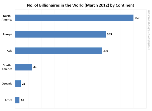
This next chart shows the number of billionaires by continent. North America has the most, because of the large number in the US. Europe is second, followed by Asia.
Data Source: Forbes

See the first series of graphs and analysis in Part 1 (Billionaires: Age Distribution, Youngest / Oldest Billionaires) and Part 3 (Billionaires by Industry).


Data Source: Forbes; Graphs: Generated by me

Thursday, March 8, 2012

Graph: The World's Billionaires 2012 (Part 1)

What is the age distribution of the world's billionaires? Who are the youngest and the oldest billionaires? Forbes just released their annual list of the World's Billionaires, which they started 25 years ago. Then, there were 140 billionaires, now there are 1,226 billionaires. [Note: The figures are calculated as at March 2012, according to this methodology.]

The next series of graphs show the number of billionaires in the world by various dimensions. This first one shows the billionaires by net worth and age (for those whose age is disclosed).
Data Source: Forbes; Only those whose age is disclosed is included
From the chart, you can see that the top 5 billionaires by net worth are (1) Carlos Slim and family (Mexican telecoms tycoon) (US$69bn), (2) Bill Gates (of Microsoft fame) (US$61bn), (3) Warren Buffett (Berkshire Hathaway value investor) (US$44bn), (4) Bernard Arnault (LVMH) (US$41bn) and (5) Amancio Ortego (Spanish fashion tycoon, of Zara fame) (US$37.5bn).

The oldest billionaire is Walter Haefner, aged 101, a Swiss software tycoon with net worth of US$4.3bn. 

The youngest billionaire is Mark Zuckerberg, of Facebook fame, aged 27, with net worth of US$17.5bn, and Dustin Moskovitz, also aged 27, with net worth of US$3.5bn, whose fortune also comes from Facebook. [In total, there are 7 billionaires whose net worth is linked to Facebook.]


From the chart, you can see a wide range of ages from which billionaires are drawn from, though the majority is around 40 to 90 years old. The median age is 62 years old, while the mean is also around there, at 62.4 years old. The age distribution is shown below.
Data Source: Forbes; Only those whose age is disclosed is included
The next chart shows the list of the 10 youngest and oldest billionaires in 2012.
Data Source: Forbes; Only those whose age is disclosed is included
You can see their source of wealth and country of citizenship here. 4 of these 10 youngest billionaires derived their wealth from Facebook.

10 Youngest Billionaires in 2012
Rank
Name
Age
Net Worth (US$B)
Source
Country
35
Mark Zuckerberg
27
17.5
Facebook
United States
314
Dustin Moskovitz
27
3.5
Facebook
United States
854
Albert von Thurn und Taxis
28
1.5
diversified
Germany
270
Scott Duncan
29
4.1
Pipelines
United States
223
Yang Huiyan
30
4.7
real estate
China
634
Eduardo Saverin
30
2
Facebook
United States
960
Fahd Hariri
31
1.3
construction, investments
Lebanon
601
Sean Parker
32
2.1
Facebook
United States
960
Ayman Hariri
33
1.3
construction, investments
Lebanon
634
Yvonne Bauer & family
34
2
Bauer Media Group
Germany

10 Oldest Billionaires in 2012
Rank
Name
Age
Net Worth (US$B)
Source
Country
248
Walter Haefner
101
4.3
software
Switzerland
491
David Rockefeller Sr
96
2.5
Standard Oil, banking
United States
223
Karl Wlaschek
94
4.7
retail
Austria
344
Kirk Kerkorian
94
3.3
casinos, investments
United States
683
Albert Ueltschi
94
1.9
FlightSafety
United States
578
Henry Hillman
93
2.2
Investments
United States
10
Karl Albrecht
92
25.4
Aldi
Germany
61
Anne Cox Chambers
92
12.5
media
United States
169
Sulaiman Al Rajhi & family
92
5.9
banking
Saudi Arabia
578
George Mitchell
92
2.2
oil & gas
United States


See the next series of graphs and analysis in Part 2 (Billionaires by Country and Continent) and Part 3 (Billionaires by Industry). 

[Updated: Added list of ten youngest and oldest billionaires]

Data Source: Forbes; Graphs: Generated by me

Tuesday, March 6, 2012

Graph: The Price of Gold & The Cash Cost of Mining Gold

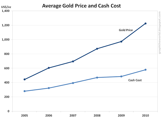
This post looks at the average gold price and the average cash cost of mining gold in recent years, in the graph below. The averages are over each year.
Data Source: VM Group, Haliburton Mineral Services
From the graph, you can see that both the gold price and the cash cost of mining gold have been increasing over the years. The difference between the two has also been increasing.

What is cash cost?
The cash cost of mining or producing gold is a term commonly used by the mining industry. It is essentially the operational cash cost of the mine per unit of production. The exact definition may vary by company. It generally includes transport, refining and administration costs and royalties, but excludes taxes, depreciation / amortization (this is a non-cash cost), financing and company-level costs (e.g. head-office expenses). Hence, the cash cost is different from the production cost of the mine.

Why is cash cost important?
The cash cost is commonly used to compare across mines. Since the gold price is the same, the mines with the lower cost would generally have higher profit margins and have a greater buffer when the gold price drops. Hence, investors often look to invest in the lowest-cost producers.

Why has the average cash cost increased?
The large increase in gold prices in recent years has allowed previously economically unviable gold assets to become viable to mine. In addition, cash costs have increased due to mining of lower-grade ore (mining to a lower cut-off grade), increase in operational costs (such as fuel costs, labour costs and consumables) and general inflation. For example, due to the commodities boom in the past few years, the demand for skilled miners and managers in the mining industry has increased tremendously, leading to an increase in their wages.

For a longer history of gold price, cash cost and production cost, you can take a look at this presentation by CPM Group. The general trend is the same.

You can also find here a longer history of the gold price alone.

Data Source: VM Group / Haliburton Mineral Services; Graph: Generated by me